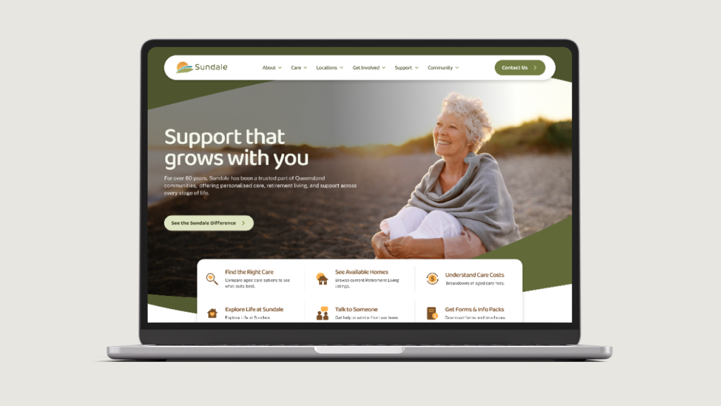
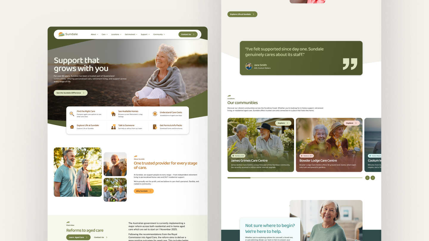
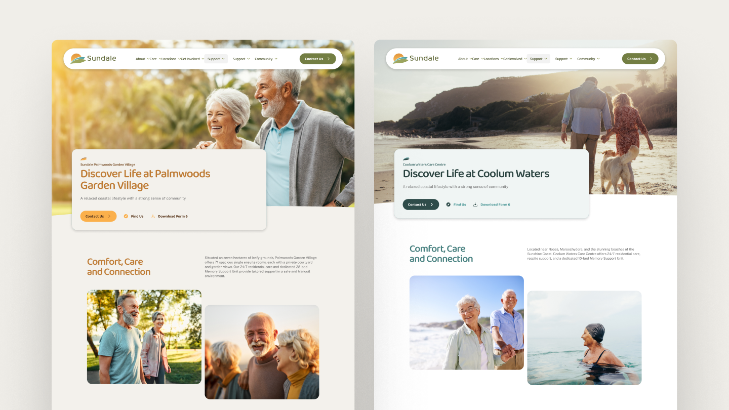
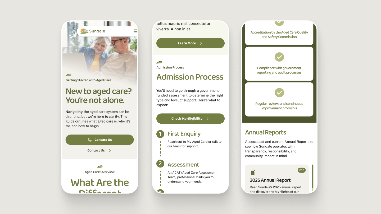
Sundale came to us with a clear challenge: their website wasn’t supporting the people who relied on it. Families felt overwhelmed, older Australians struggled to find essential information, and the experience didn’t reflect the warmth and trust at the heart of Sundale’s care. Instead of offering clarity, the site added friction to an already sensitive decision-making journey.
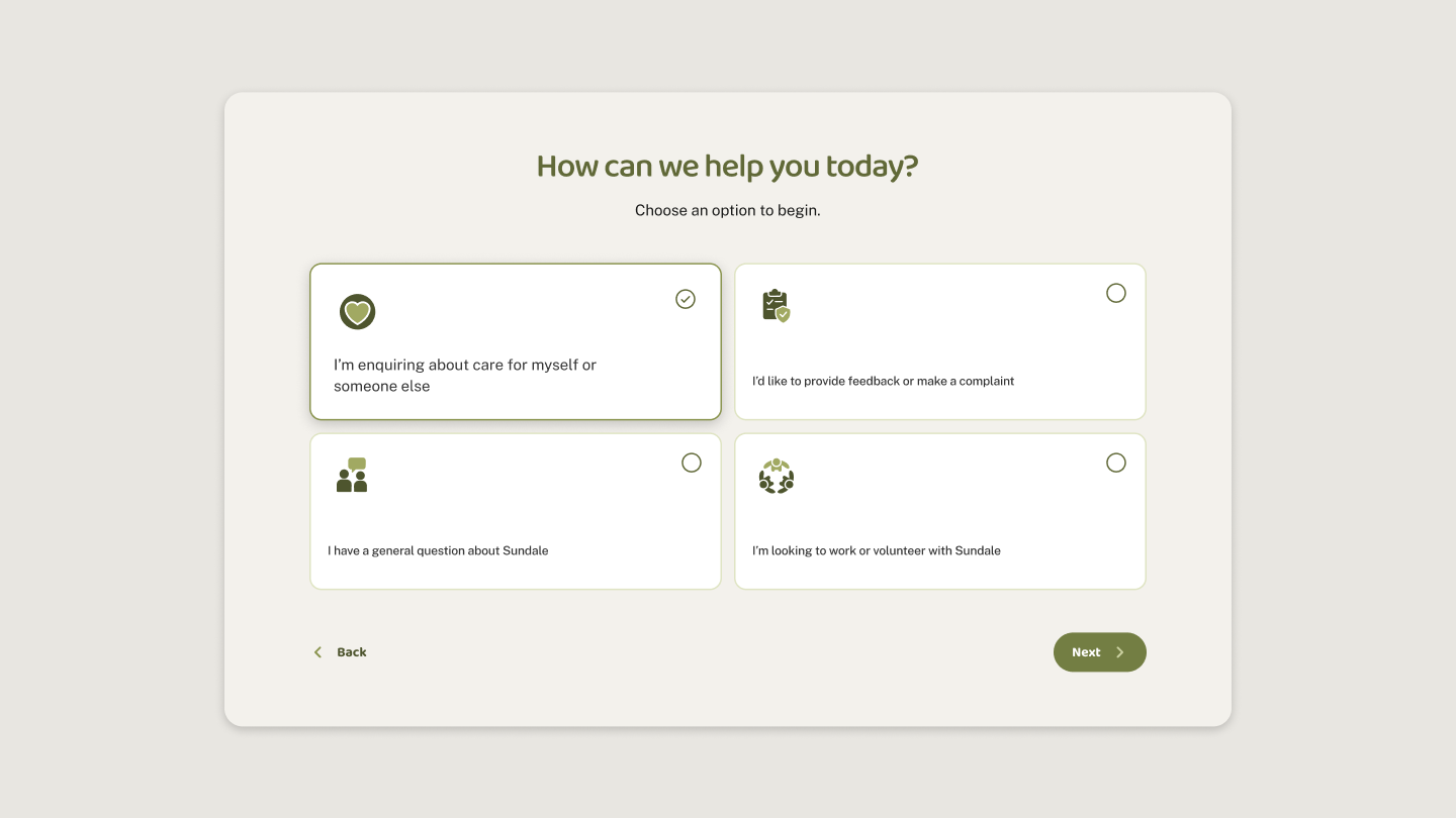
We rebuilt the experience using a human-centred, accessibility-first approach. Clear pathways, simplified language and legible typography reduce cognitive load, while a guided enrolment flow turns a complex process into calm, step-by-step stages. Paired with a softer visual palette and people-led imagery, the new site brings Sundale’s values to life and empowers visitors to confidently connect with the care they need.